Using the Color Wheel to Create Lighter Color Combinations: A Step-by-Step Guide with Examples
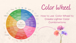
The color wheel is an essential tool for selecting harmonious color combinations in design. When creating lighter color schemes, it becomes a powerful guide for selecting colors that are visually soft, balanced, and calming. By understanding how to use the color wheel with lighter shades, you can craft beautiful palettes that are both appealing and tranquil. Below, we’ll walk through how to use the color wheel to build lighter combinations, complete with examples.
1. Start with a Base Color
Every color palette begins with a base color, which acts as the foundation for your design. This base can be any primary color, secondary color, or more complex hue, and it sets the tone for the rest of your color scheme.
Example:
Let’s say you choose blue as your base color. Blue is calming and versatile, making it an excellent starting point for lighter combinations.
2. Use Lighter Tints of Your Base Color
One of the simplest ways to create a lighter color palette is through tinting—the process of adding white to your base color. The more white you add, the lighter and softer the color becomes. This method produces pastel hues that are perfect for creating light and airy color schemes.
Example:
If your base color is blue, you can create lighter tints such as:
- Sky Blue (a soft, light blue with a calm feeling)
- Powder Blue (a very light, almost pastel blue)
- Baby Blue (a gentle and soothing light blue)
These tints will make your design feel light and airy while still retaining the essence of the blue hue.
3. Explore Analogous Colors for Harmony
Analogous colors are colors that sit next to each other on the color wheel. These colors naturally complement each other and create a harmonious, cohesive look when used together. When working with lighter tints, analogous colors allow for a gentle, flowing design.
Example:
If you’ve chosen blue as your base color, consider pairing it with lighter tints of green and purple, which are next to blue on the color wheel:
- Light Green (a soft, pastel green)
- Lavender (a light, soft purple)
Together, these analogous colors will create a soothing, monochromatic palette that feels naturally connected and harmonious. The lighter versions of these colors won’t overpower each other, resulting in a peaceful design.
4. Pair Complementary Colors with Light Tints
Complementary colors are those located directly opposite each other on the color wheel. Typically, they create bold contrast when used together. However, when working with lighter tints, complementary colors can provide a soft yet visually stimulating combination.
Example:
If you’re using blue as your base color, the complementary color on the color wheel is orange. To keep the combination light and soft, you can pair a light blue with a pale orange or peach:
- Light Blue (a soft blue tint)
- Peach (a soft, pastel orange)
These two colors create a balanced contrast, with the cool blue paired with the warm, soft orange. The lighter tints help maintain visual interest without the harshness of full-saturation complementary colors.
5. Consider a Monochromatic Approach
A monochromatic color scheme involves using different shades, tints, or tones of a single base color. This creates a cohesive and unified palette, and when using lighter tints, it can result in a gentle, sophisticated design.
Example:
If your base color is light blue, you can create a monochromatic scheme by exploring various lighter versions:
- Baby Blue (a light, pastel blue)
- Powder Blue (a slightly lighter, softer blue)
- Pale Turquoise (a blue-green mix in a soft, muted tone)
By using these different shades of light blue, you maintain a uniform look throughout the design, with each shade flowing naturally into the next.
6. Incorporate Neutrals for Balance
While lighter colors are often delicate and subtle, incorporating neutral colors can help ground the palette and add depth. Neutrals like white, beige, light gray, or soft taupe allow your lighter colors to pop without overwhelming the design.
Example:
If you’re using a light pastel palette (like soft pinks, blues, and purples), pair these with a neutral background color such as:
- Light Gray (a soft, neutral backdrop that complements pastel tones)
- Cream (a warm, off-white that works well with lighter hues)
These neutrals will provide balance and contrast to the lighter, softer colors, preventing the design from feeling too “washed out.”
7. Test and Adjust Your Color Combinations
Once you’ve chosen your colors, it’s important to test them together in your design to see how they interact. Sometimes, even lighter colors might clash, or the palette may need further adjustments to achieve the right balance.
Example:
After pairing light blue with peach (complementary colors), you might find that the contrast is too stark. To adjust, you could choose a more muted peach or even introduce a neutral like light beige to soften the combination further.
Testing your palette allows you to ensure that your color scheme feels cohesive and visually pleasing.
Conclusion
Using the color wheel to create lighter color combinations is a fantastic way to achieve harmonious, calming designs. Whether you’re working with analogous colors, complementary colors, or exploring a monochromatic scheme, the key to success lies in selecting light tints and balancing them carefully. By incorporating neutral tones and testing your combinations, you can create a visually soothing palette that evokes tranquility and elegance.
With these strategies and examples, you’ll be able to design stunning light color schemes that are both beautiful and balanced. Happy designing!